
How to Design a Logo Icon in Adobe Illustrator
Welcome to our brand new logo design tutorial. In this tutorial, we are going to learn how to create a logo icon using Adobe Illustrator in simple and easy steps. If you are a graphic design artist, you can follow along easily. If you are not, the steps are described simply and you can still learn the ropes. Through this beginner-level tutorial, we aim to equip young designers with professional logo design knowledge so they can create their portfolios, apply to design jobs confidently, and even take on freelance work.
So, keep on reading as we discuss how to create a logo design using Adobe Illustrator for the most precise and neat illustrations.
Table of Contents
Why Adobe Illustrator?
Designers – experts and new – consider Adobe Illustrator as the best software program to choose when designing a logo or a whole new brand identity for a brand. There are multiple reasons behind it. Let’s look at a few.
- Vector-Based
The software is a vector-based program; meaning, what you create on Illustrator is created as an original vector and not in pixels. When you scale that work, the resizing won’t affect the image quality.
- Ability to Import:
It allows you to import your artwork from your sketchbook to the Illustrator panel quite easily. You can then trace over your drawings or use them as a reference for new work. As you can imagine, it makes your work more precise.
- More Control:
It gives you a large amount of control because it has tons of design features that enable you to create the exact shape and angles you want – no compromises. With its free-flowing drawing features, there’s no limitation to what you can or cannot create in the program. That’s why it’s the software of choice for professional designers.
Now that you know why designers everywhere prefer Illustrator, let’s look at the steps below to learn how to create a logo using the program.
How to Design a Logo in Adobe Illustrator with 8 steps?
1. Create a New Document

There are two ways to start. You can import a sketch and trace it, or open the canvas and start drawing on it right away. We will use the former – importing a sketch – and go from there.
So, open your Illustrator and create a new document. Click on File from the menu, go to Place, and click on it. A dialog box would appear. Choose your file from there and click on Place to import the file.
You can also simply drag and drop it on your document but knowing the menu bar always helps. Now create a new layer and start drawing. Working with layers keeps your work organized and allows you to edit the content on one layer without affecting the content on other layers.
2. Rectangle Tool
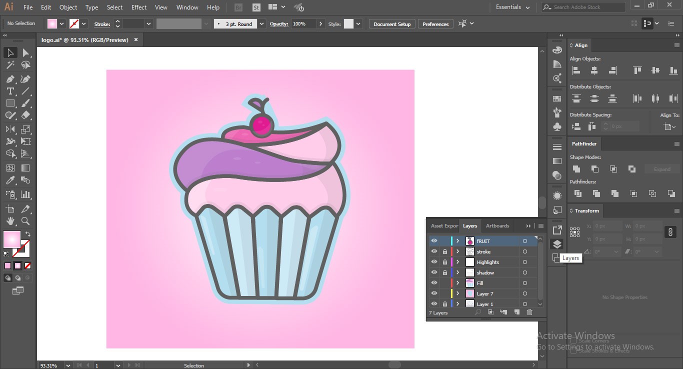
Press M and access your Rectangle tool. We will draw the cupcake lining first. Place the first rectangle on the first fold of the lining, click on Stroke Options > Align Strokes, so a triangle at the top appears. Now duplicate the shape by pressing Alt/Opt and drag the shape to the next bar. Now press Ctrl/CMD + D to redo the last step. Do it for all bars.
When you are done, press E for the Free Transform tool. Now you can make the upper portion of this rectangle barcode a bit spherical. Now hold and drag the upper portion wide.

Move it around, so it’s exactly on top of the sketch.
3. Use the Pen Tool
Now comes the tricky part: using the Pen tool. The Pen tool is a great tool in Adobe Illustrator as it allows you to create paths and anchor points that design easily manageable free shapes. You can create curves, angles, points, and adjust their preciseness in exact places.
We’ll use the pen tool to create the curves of the cupcake cream.
Click on the Pen tool, move along the line of the sketch and keep on leaving the anchor points by clicking on places where you want the Pen tool to continue the stroke. Continue drawing without worrying about being exact and precise. You can always edit later. Right now, just follow your gut and keep on tracing.
Make sure to treat use each swirl of the cream as a separate shape. With your Pen tool, create the upward swirl and then bring the stroke down and close the shape. Repeat the procedure on all of the swirls.
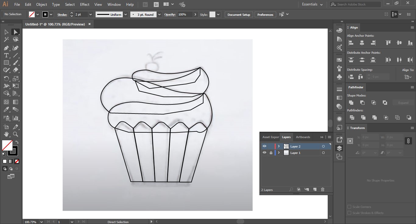
Now, adjust the corners, bring the intersecting points at precise locations, make sure that the lines are perfect and look organic.
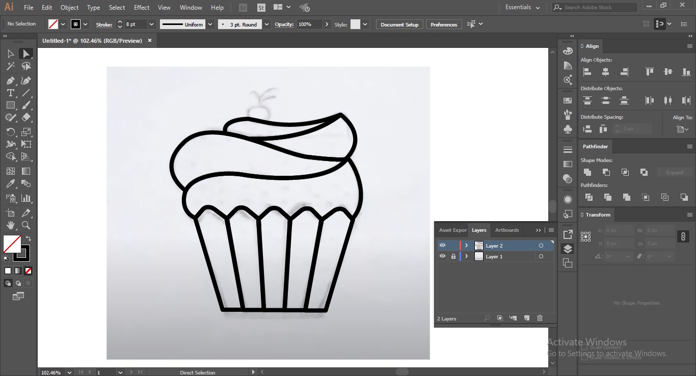
4. Remove the Excess Lines
Now, select the whole shape and bring it into Outline mode by pressing Ctrl/CMD + Y. Access the Shape Builder tool by pressing Shift + M and remove the excess lines within the shape. Move your pointer on the lines and intersecting points that you want to remove.
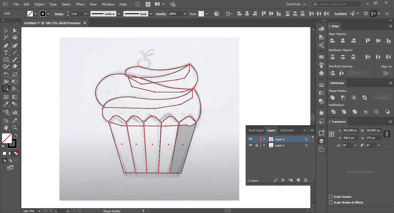 Now you can click on each swirl and each rectangle of the cupcake lining and you’ll be able to select each as a unique, separate shape.
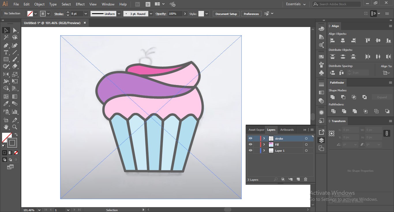
Come back to the outline mode, select the whole shape, and click on the Stroke panel. From there, increase the weight of the stroke to 8pts.
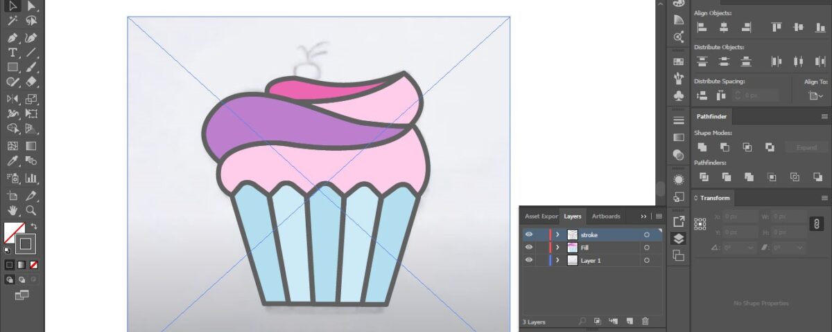
5. Begin Coloring
Select the shape, switch from Fill to Stroke, and choose the color that you wish to give your outline. We are keeping the black as is.
Now, go to your color swatches, and using the Fill feature, start coloring the shape. We are going to use pastel shades for the liner: sea green and light green for us. Alternate between these two colors in each bar of the liner.
For the swirls, we’ll start from the bottom one and go upwards. So, the first swirl would be a rose pink, then dark purple, again the rose pink, and magenta on the top swirl.
When you are done coloring, select the whole shape and save it on a layer.
6. Shadowing
Shadowing allows you to elevate your design. It introduces a 3D effect to the design which looks quite appealing.
To draw the shadows, we’ll again go to the Pen tool. To access it, press P. Now start creating anchor points from top to bottom on each bar in the cupcake liner. Do it for all 5 bars. The action will remove the color from the selected area, but that’s fine. Keep going. If you want, you can add other colors in these spaces but we won’t be doing that today.
Now, select all the bars – each divided into two parts now due to anchor points – and change the opacity of the whole area to 10%.
You now have shadows on your cupcake liner.
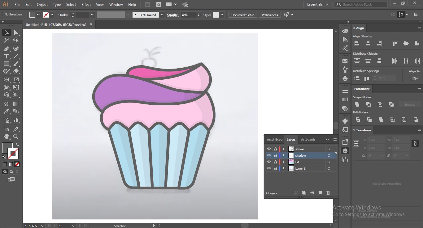
Now add the shadows on the right curves of the swirls. Use the Pen tool. Create paths on both the pink swirls and the narrow edge of the purple swirl. Then, reduce the opacity. When you are creating shadow paths on the swirl, make sure that the shadow on the cupcake liner corresponds to the shadow line you are creating on the swirl above it.
You need to do it to keep the effect of the light intact. Save this layer.
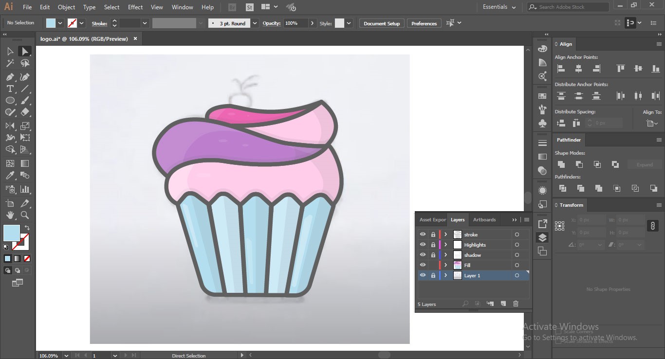
7. The Cherry on Top
To create the cherry on the top, use the Ellipse tool. Press L to access the tool and place the shape on top of the last swirl. Use a dark red cherry color and fill the ellipse with that shape. To create the stem and leaf of the cherry, press Alt/Opt + Drag and duplicate the shape you’ve just created.
Remove its bottom half and change its inner color to the purple we have used in our swirl. As a shortcut, you can use the color picker tool and just drag the color right from the swirl. Now reduce its size till it’s in the shape of a curved stem. Place it on top of our cherry.
Come back to the other half of the duplicated shape. Using anchor points, manipulate its shape till it looks like a leaf. Place it alongside the stem.
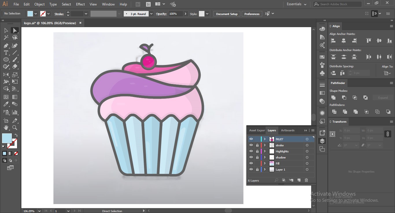
8. Finalizing It
We are going to give our logo icon a ‘glow’.
Select the entire shape. Go to Object > Path > Offset Path. The action will bring the color of the cupcake liner to surround the whole shape. This will leave your logo icon looking like a unique shape. You can then add your brand name and a tagline under it and your design is ready.
Summing Up
So, there you have it! A detailed, 8-step tutorial that teaches you the craft of logo design using Adobe Illustrator. If you are a new designer, the program with its seemingly limitless features may appear too overwhelming. But don’t feel intimidated – it wants to become your friend. So, approach with confidence and take one day at a time. The rest depends on practice. And you know what they say about practice.
So, keep at it.


